Tuesday, 15 October 2013

Title Block Analysis

I have created an analysis for 3 different mastheads of music magazines such as Kerrang!, Mojo and NME.

Kerrang!

Kerrang! is a rock-based genre music magazine. Because of the etched markings on the title, it shows that the magazine is quite rebellious and solid and shows that it is a rock magazine. The colour scheme consists of Black and white and uses a neutral colour which creates simplicity but such colours will appeal to the majority of the target audience which are male. The title of the magazine “Kerrang!” is an onomatopoeia for a strumming of an electric guitar which is a fundamental instrument used in rock bands and music. The title then shows that the magazine is appealing to music lovers and has a forte in rock genre. It also appeals to the the rock genre fans as it catches their attention by using a sound wave as a title. 


MOJO

MOJO magazine shows a bit of monotonous colours and creates a dull effect which is more likely shown in classical or antique music. It doesn’t really catches the attention of the audience unlike Kerrang! and NME which uses bright and neon-ish colours to attract their audience. The colours that Mojo uses are white, grey and neutral colours. And these colours are largely used to present antique notions such as classical and elegant music. MOJO means magic or charm which is relative to classical music as they present tones in magical and very majestic way, as if in a fairy tale. Also, MOJO refers to the older audiences where they use the word to describe their emotions and thoughts at that time. 


NME

By looking at NME’s colour scheme which are red, white and black, it creates the idea that the magazine is a rock and punk music magazine. The colour scheme gives off a very bold, strong and firm appearance which largely appeal to the audience. The font used is bold and large which is noticeable and will largely entice any reader as it is vibrant using a strong colour such as red which connotes strength and firmness. Also NME is abbreviated as "New Musical Express" which refers to the haste delivery of music [haste delivery - "express"]. NME is pronounced like the word "enemy". This shows rivalry between and among all the other music magazines. The target audiences are more likely to be in the age bracket of 15-19 because the title block appeals to them which is modern, powerful and fierce.

Thursday, 10 October 2013

Focus Group


The Focus Group tends to discuss the purpose and queries about the magazine that I am creating which is an Anime/Japanese-Korean Pop Music Magazine.

I found out that having different age brackets had helped in maintaining interest between the age groups and
it also distinguishes the audience properly as it gives proper attention to the different age brackets as they have different interests.

I also found out that it is convenient to introduce this kind of genre to those who are not fond of this kind of music but has an open mind. Being it for a niche audience, it is excellent to let other people know about the existence of this kind of music. I also found out that it would be interesting to the fans of this music as in the current market, there is no music magazine about Japanese and Korean Music even though it's popularity is expanding in the U.K.

Having an indefinite price range with a minimum of £1.00-£2.00 is really proper as it has a niche audience and the frequency is fortnightly. Also, the magazine targets younger audience who are unemployed and in school so it has to be affordable.

THANK YOU SO MUCH FOR WATCHING!

Tuesday, 1 October 2013

Initial Planning of a New Music Magazine


Media Used: Adobe Photoshop CS6, Microsoft Word 2010

Sources:
http://www.pixiv.net/member.php?id=40357
http://artrockerispunkd.deviantart.com

Questionnaire and Analysis

Questionnaire Link: http://www.surveymonkey.com/s/XW98RBZ


Questionnaire Results and Analysis


 In question 1, the 3 genres that stand out most are pop, rock and R&B followed by KPop, JPop and Cpop.
This will help in determining which genre I will choose for the magazine.


In question 2, the audience are being updated through the Internet. With this result, it will help me decide whether or not I should publish the magazine through the internet or through printed media.
In question 3, 45.5% of the audience (almost half of the participant) don’t buy music magazines. With this result, it will help me decide whether or not I should publish the magazine through the internet or through printed media.
In question 4, most of the audience are willing to pay £2.00-£2.50 for a monthly magazine. This is a majority of votes will help me decide how much my magazine will cost.

  In question 5, I asked what the most appropriate title of a music magazine is and more than half voted for “Gravitation”. In this question, it seems like the audience would go for a familiar word rather than having an exotic word such as "Bebop".
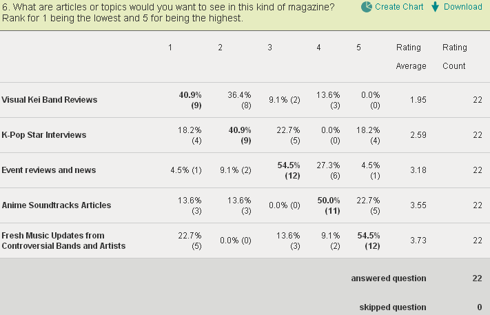
In question 6, the audience voted for fresh music updated from controversial bands and artists for the topics that will be included in the magazine. This will help me choose out a topic for the main article that will be featured in the magazine.
In question 7, the freebies or promotional item that the audience would like to receive are posters/ signed posters. This will help me in what marketing techniques I could add to make my magazine more appealing to the audience.
In question 8, the aim is to find out the audiences’ sex demographics and most of them are female. By knowing the sex of the audience, I can give an overview to prioritise a gender over the other.
In question 9, the aim is to find the audiences’ age demographics and most of them are 16-18 years of age. By having an awareness of which I can address my magazine to, [which age bracket], it can help me decide over the maturity level of the magazine.
In question 10, the audience is attracted to the central image or model being presented in the magazine cover. This will give me awareness to make the cover image stand out than the rest of the conventions in the magazine cover.

Monday, 30 September 2013

Institutional Research


This slideshow presents the institutional research about the leading publishing companies internationally and/or in the UK.

By having this research created, I have found out the image and representation given by each company to their magazines and how they prioritise their audiences in picking out the topicality of each magazine issue. I have also found out a bit of historical information about the founding of each company and what kind of magazines and audience they have.

Tuesday, 24 September 2013

Kerrang! Double Page Spread Analysis


Kerrang!’s 21 September issue features Sleeping with Sirens, an American post-hard core band who will have a concert in O2 Academy Brixton in three weeks’ time. This suggests that the target audience for this particular section of the magazine are the fans and devotees of the band. The audience might be also those who are interested in rock and may want to listen to the music of the featured band. Since the band’s frontman, Kellin Quinn is the one being interviewed, along with a few words from his band members, this shows that target audience may want to know about some revelations about the vocalist.

The article uses informative language wherein it notifies the audiences about the band’s controversies and plans in their upcoming concert. The language used is also chatty and quite comfortable because the interviewee – Kellin Quinn is talking about his personal life and his family affairs with the magazine such as about his daughter, his father and the bands the he has rivalry with. This is evident in the lexis such as “… and poppy diapers, man”, “My dad was annoyed about it at first.” And “I don’t have anything against Oli Sykes.” These languages used by Quinn are very personal which conveys that he feels comfortable and intimate in doing the interview between the magazine and their fans.


The colours that are used are purple, bright pink, white and yellow. This is because Sleeping with Sirens fans are mostly female. The colours that were used adhere to the dominant target audience of the featured band. Purple and yellow are contrasting colours which makes one stand out that the other. It also makes the page complimentary and pleasant. The use of a neutral colour like white simplifies the contrasting colours and makes it more enticing and attractive to the readers, especially for the dominant female audience. However, it doesn’t disrupt the magazine’s house style as it also uses one of the magazine’s main colours which is yellow. This shows the connectivity between the magazine and the featured article. Also, by using purple, which is not adherent to magazine’s colour house style; this shows emphasis to the featured article because it’s different from the rest of the given article highlighted in the magazine.

The double page is laid out in such a way that the image of the featured band is located at centre and the description and title at the upper right and left corner of the featured image. The article is situated in the lower right hand side of the page. This shows that the emphasis is on the image of the featured person or band – in this featured article’s case, it is an image of Sleeping with Sirens’ frontman Kellin Quinn. On the other pages which are a continuation of the article, the images that were featured was Quinn and the rest of the band. This is so because the interviewee is the frontman, Quinn. In the six-page featured article, the pictures are dominating the articles itself. The fonts that the article used are quite small and white in colour which might not show emphasis but is still noticeable. There is an enormous image of the band in each page which creates emphasis to the band appearance.


The tone that the magazine used in this particular interview is that of a ‘close friend’. This is because of the use of swear words such as “f*cking* without any sensors. This conveys that the interview is set in the tone a very close friend because if it was formal, the interviewee would not use such vulgar words and the interviewer would not tolerate it as well.

Relevant to the image, the band is presented to the audience as strong and noise bunch of people because of the mise en scene. For example, the prop used is mostly megaphones which connote attention and loudness. Also, all of the band members are wearing tattoos which represent them as strong and confident people. Shown in their facial expression is that of a person who is shouting or yelling comprehends that the band wants attention from the audience and from the rest of the band members as well. In short, the band is represented as people are confident and loud which catches people’s attention.


The article demand prior knowledge when reading the featured article. For example, the bands mentioned such as “My Chemical Romance” (currently disbanded) and Fall Out Boy which have taken a mainstream position in the rock-genre world. Quinn refers to his band as not a “MCR” or not a “FOB” which conveys that his band is not mainstream yet but he just wants to make “awesome music”. Another example is his rivalry with Oli Sykes, a member of the Bring me to Horizon which is a UK based band. In the article, it doesn’t specify who Oli Sykes is, only that he is a member of a band and he is a musician as well.