Thursday, 16 January 2014

Wednesday, 15 January 2014
Sunday, 12 January 2014
Planning for Photo shoot
Location
Media Class Room with Green screenMedia Equipment Required
Lighting, Nikon DX, Green Screen
Props
Black Vest, White knitted bracelet, Black bowler hat,
Bright pink blouse, Microphone
Actors
Athena Ashley Rosales, Tyler Young, Guste
Palsuskaite
Monday, 16 December 2013
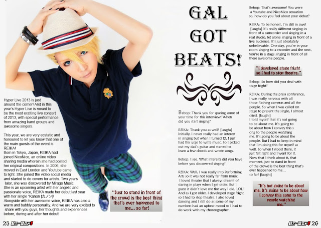
Double Page Article [Draft]
In this post, my draft layout will be presented for my triple page article. I have created 3 pages for the main article to give focus on the main cover artist which is REIKA. It is also distinguish it from other articles on my magazine.


Tuesday, 26 November 2013
Peer Assessment and Improvements Made


To make sure that my work can be improved, the peer assessment is presented to make sure I maintain a professional layout and consider the target audience for my music magazine cover and contents page drafts.
Student Name 1:
Athena
|
How To Improve
| |
Level/ Mark
|
Front Cover
|
Contents Page
|
Front Cover : Level 4/50
Content Page: Level 4/52
|
The Front Cover is great it complements the genre. The text used upon the page has a great font. The only problem is the purple text for ‘The Exclusive Interview’ its slightly hidden and is hard to make out, the barcode could be made smaller but other from that it’s an awesome front cover
|
The content page is also great, the colour scheme is awesome and the use of the front cover upon the content page makes It more professional. The numbering of the page can be changed, having page numbers up to around 75? Still the magazine looks awesome; the use of the web addresses as well looks very professional.
|
Student Name 1:
Athena
|
How To Improve
| |
Level/ Mark
|
Front Cover
|
Contents Page
|
Front cover
Level 4 – 52 marks
Really good, the font goes well with the image, and it is clear and easy to read. The colour scheme suits the genre.
Contents Page
Level 4 – 54 marks
It’s really good! Looks really professional. Everything looks equally spaced out, which makes it easier for readers to see, all the fonts and colours are clear.
|
The improvements that could be made, maybe for the colour of price and the month to be black, so that it would be more clearer for readers to see. Also for the puffs to be raised a bit higher so that it looks more even and spaced out.
|
Space out the contents numbers a bit more.
And maybe make the links a bit larger.
|
These are the improved draft based on the peer assessment:

For the cover page, I reduced the size of the bar code and re-position the date and the price. I also made the anchorage text "The exclusive Interview" bolder and have a under tone to it. I also change the price's font to make it more visible.

In the contents page, I changed the pages up to 60. This to make sure that audience gets what they paid for.
Monday, 18 November 2013
Contents Page [Draft]
In this post, my draft contents page layout is presented i which follows the colour scheme of white, black and red which was proposed earlier in the final magazine proposal. The contents page also has given a reference to the cover page to make sure the house style and the connection between to the two pages are distinguished.

Tuesday, 12 November 2013
Cover Page [Draft]
In this post, my draft layout of the front cover will presented. I will also adhere to the given proposal in which I will show how the colour schemes were presented in the front cover page.


Subscribe to:
Posts (Atom)