Tuesday, 26 November 2013

Peer Assessment and Improvements Made


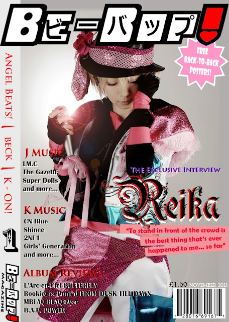
To make sure that my work can be improved, the peer assessment is presented to make sure I maintain a professional layout and consider the target audience for my music magazine cover and contents page drafts.

Student Name 1:
Athena
How To Improve
Level/ Mark
Front Cover
Contents Page

Front Cover : Level 4/50
Content Page: Level 4/52


The Front Cover is great it complements the genre. The text used upon the page has a great font. The only problem is the purple text for ‘The Exclusive Interview’ its slightly hidden and is hard to make out, the barcode could be made smaller but other from that it’s an awesome front cover
The content page is also great, the colour scheme is awesome and the use of the front cover upon the content page makes It more professional. The numbering of the page can be changed, having page numbers up to around 75? Still the magazine looks awesome; the use of the web addresses as well looks very professional.


Student Name 1:
Athena
How To Improve

Level/ Mark
Front Cover
Contents Page
Front cover
Level 4 – 52 marks
Really good, the font goes well with the image, and it is clear and easy to read. The colour scheme suits the genre.

Contents Page
Level 4 – 54 marks
It’s really good! Looks really professional. Everything looks equally spaced out, which makes it easier for readers to see, all the fonts and colours are clear.


The improvements that could be made, maybe for the colour of price and the month to be black, so that it would  be more clearer for readers to see. Also for the puffs to be raised a bit higher so that it looks more even and spaced out.


Space out the contents numbers a bit more.
And maybe make the links a bit larger.


These are the improved draft based on the peer assessment:


For the cover page, I reduced the size of the bar code and re-position the date and the price. I also made the anchorage text "The exclusive Interview" bolder and have a under tone to it. I also change the price's font to make it more visible.

In the contents page, I changed the pages up to 60. This to make sure that audience gets what they paid for.

Monday, 18 November 2013

Contents Page [Draft]

In this post, my draft contents page layout is presented i which follows the colour scheme of white, black and red which was proposed earlier in the final magazine proposal. The contents page also has given a reference to the cover page to make sure the house style and the connection between to the two pages are distinguished.


Tuesday, 12 November 2013

Cover Page [Draft]

In this post, my draft layout of the front cover will presented. I will also adhere to the given proposal in which I will show how the colour schemes were presented in the front cover page.


Planning for a New Artist Cover

In this post, the brief biography of the new artist that will be featured in my magazine will be presented. The stereotypes and the music genre will also be stated to give a brief idea about the artist's personality and attitude.


Flat Draft for my magazine Pages

This post shows my Flat draft for my magazine pages including my front/cover page, contents page and article page spread.

I have used the drawing platform Wacom Bamboo Tablet and the drawing software Paint Tool Sai Japan to create my flat drafts digitally.


Tuesday, 5 November 2013

Title Block Design

The final title block design is presented and will be commented on how it is appropriate for my given genre.


This title block design gained 42% of the votes on the poll which helped me decide which design is most appropriate for the magazine.


It is appropriate for my given genre which is Japanese and Korean Pop and Anime because the font was renowned by the children cartoon Powerpuff Girls which have a connection with animation and Japanese co-creators. The idea is to give priority to the majority of the target audience which is female and the bubblegum-styled font creates this representation.

Since there are a niche male audience, I will alter the colour scheme to blue, purple, red, fuchsia and black. The red and black colour schemes are chosen because these colours are common in comics and mangas which is one of the main trade products of Japan and Korea. The blue, purple and fuchsia colour schemes attend to both female and male audience and it appeals to the whole genre of the music magazine.

The final design is:
in which the Japanese translation is merged with the title.